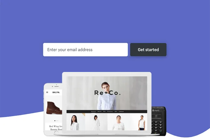
A landing page is the page someone reaches after following a link. In campaign work, the term often means a page built for one offer or audience. Its job is to meet expectations and make the next step understandable.
This does not mean removing every other link. Customers may need to research the business, read terms or find contact information before deciding.
Start with the ad’s promise
Write down the need that brings the customer to the page. The heading, opening explanation and images should confirm they are in the right place. A general company page may be a poor answer to a specific campaign promise.
Where relevant, also clarify whom the offer is not for. This can reduce unsuitable enquiries and improve conversations with people who actually need the service.
Explain enough for the customer to choose
Show what the customer gets, how the process works and what affects price or delivery. Use evidence suited to the situation: a real project, a demonstration or a clear description of the work.
Avoid invented reviews and results claims without a period or definition. Address the customer's uncertainty rather than hiding it behind grand claims or more buttons.
Choose one clear main action
The page can have one priority, such as a service enquiry, registration or product order. The button should describe the action. Repeat it where helpful on a longer page, but avoid competing calls to action in every paragraph.
Readers who are not ready to make contact can be offered a relevant path to more information. That is better than a dead end for everyone who needs further clarification.
Make the form usable
Ask for necessary information and explain why less obvious fields are needed. Give fields visible labels, clear errors and confirmation that submission succeeded. W3C’s forms guidance is a useful technical starting point.
Separate the contact request from a marketing subscription. Check where the data goes and who follows up. Also test how duplicates and technical errors are handled, so customers are not led to believe everything has been received.
Confirm the next step without overstating it
After submission, customers should know what was received and what happens next. Only state a response time you can meet. A thank-you page can help, but it is not the only way to provide an accessible confirmation.
Measurement should reflect an actually accepted submission, not just a click on Submit. Test visits to a thank-you page must not be recorded as new customers.
Measure and improve using consistent definitions
Assess relevant enquiries and conversation quality alongside visits and cost. Note changes in offers, traffic and measurement. Change one main factor at a time when trying to understand impact.
Read the guide to measuring results for comparisons and four steps from visit to contact for the whole journey.